The Challenge
As part of the company’s app redesign, MetLife wanted to integrate claim filing in to the native experience and create a simple, streamlined way for users to report First Notice of Loss on their insured vehicles.
Quick Intro
We’ve all had days that, for lack of a better way to say it - are better left forgotten. Sometimes, panic from the need for immediate solutions can distract us from doing what actually needs to be done. This experience aimed to be one less stressor for drivers caught in a pretty pickle.

Intake
One of the fundamental goals with claim intake was to gather as much incident-related information as possible from users while filing their claim through the app. The flow guides users towards providing critical information in app, with the intent of ensuring process efficiency and keeping costs down for the business by reducing the need for early human intervention.
Basics First
The flow is designed to capture critical information first, taking users through a focused set of screens that provide the system the data necessary to create the claim - regardless of if a user chooses to complete their submission at a later time or opts to provide additional information by phone.


Byte-Sized Decisions
A key principle guiding the design process was keeping information and information capture from overwhelming users. One of the ways in which this was achieved is by presenting information intake in segmented, digestible ‘chunks’ - reducing cognitive overload and maximizing efficiency in the process.

Assessing the Damage
Getting a birds-eye level understanding of the extent and type of damage inflicted on a vehicle is a core element in claim intake. The main challenge here was finding the sweet spot between simplifying the information required enough for the layman user to easily provide on the go, but also having it be descriptive enough to begin processing the claim.


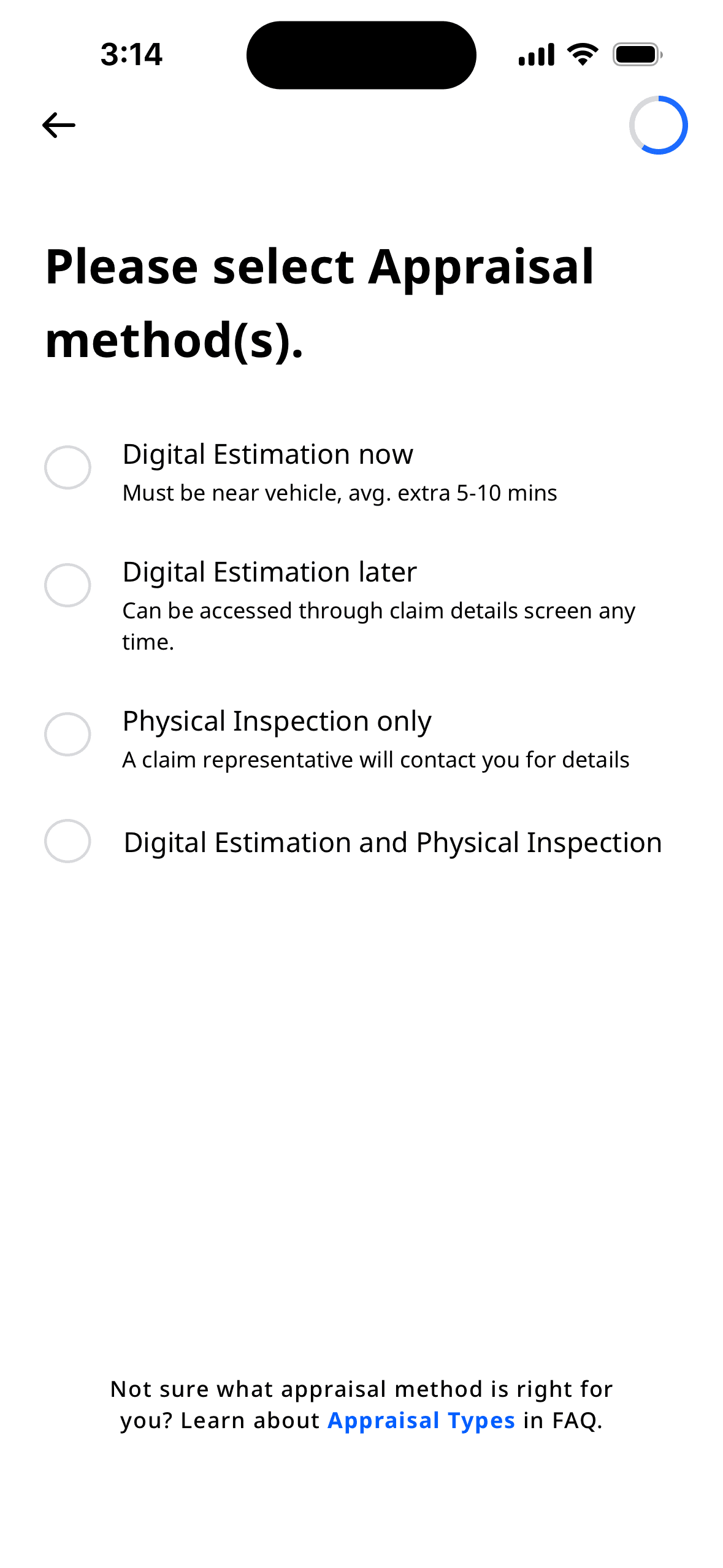
Appraisal and Estimation
In order to provide an appraisal for damage costs, users can either opt for an in-app digital estimation, an in-person physical inspection, or both. The digital estimation process is achieved via a third party API with a step-by-step flow collecting data necessary for estimation.
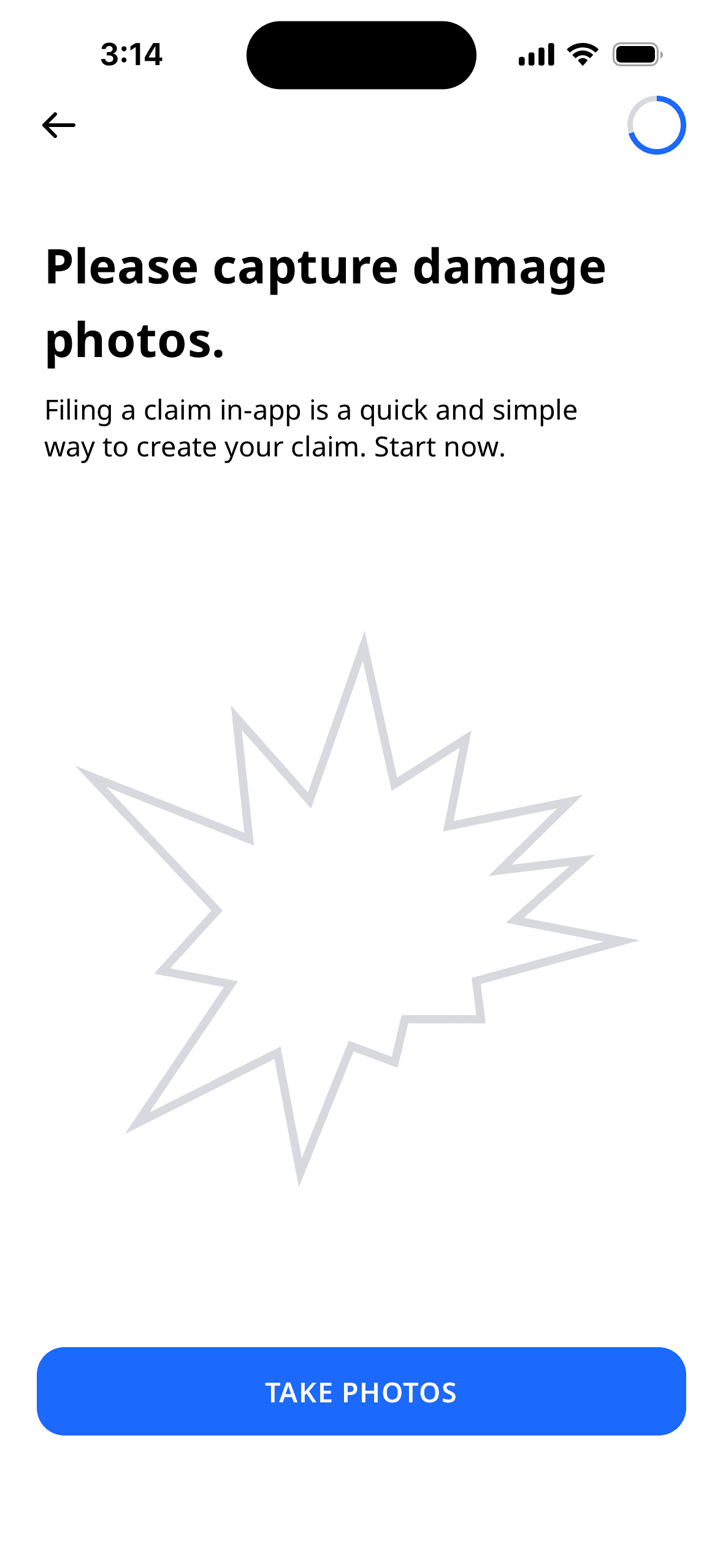

Finishing Up
In order to avoid confusion, claim submission bells and whistles were kept to a minimum. The flow directs users to submit their claim and provides visual feedback on the progress bar once submission is completed.


Let's hop on a call to chat about how strategic UX empowers us and helps train smarter systems.